FEEDBACK FRIDAY: This Week in Natural Dye Questions

    Each week, we are emailed with questions from our natural dye community asking simple and complex questions that we thought might be worth sharing. Here are a handful from this week answered by natural dyer in chief, Kathy Hattori, Founder of Botanical Colors: I just saw that Pantone created Love Symbol #2, an amazing shade for my favorite musician, Prince. Do you have an idea of how to create that color? Logwood chips used at about 50% wof with wool or silk mordanted with aluminum sulfate only (no cream of tartar) will make a rich reddish purple very … Read more

A Pantone Inspired Airbnb Fit For Color Enthusiasts

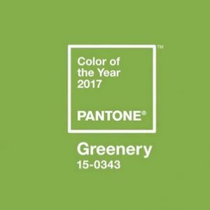
We haven’t acknowledged the Pantone color of the year enough so we’re glad to see others who are and in the most fun of applications. Stay tuned for a natural dye recipe we’ll be creating soon where you can achieve this color for your own design projects. According to Dezeen, “Pantone has collaborated with Airbnb to fill a London home with planting and projects that match its verdant 2017 colour of the year. “Pantone had announced the tone which it describes as a “tangy yellow-green”, as its pick for colour of the year in Decembe 2016. The annual selection is … Read more

How ‘Pantone’ Became The Definitive Language Of Color

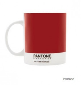
Fast Co.Design writes: “Back in the early 1960s, Pantone was a printing company in Carlstadt, New Jersey, with a specialty in color charts for the cosmetic, fashion, and medical industries. Lawrence Herbert joined the company in 1956 and noticed how difficult it was for designers, ad agencies, and printers to communicate—identifying exact colors from names alone is tough. For example, there are red-based purples and blue-based purples, warm and cool shades, lighter and darker tones. Mistakes happened, there were tons of inefficiencies due to reprints, and Herbert knew there had to be a better way to do things. He bought … Read more

2012: The Year of More Color

How is it that we can look at a washing machine that is Harvest Gold and instantly date it to the 70’s?  Or say “Santa Fe colors” and know that we’re speaking of a greenish teal, terra cotta, sage green and mauve?  The answer is color forecasting.  Each year a number of color experts meet (there are many forecasting organizations) and discuss the direction that colors are taking based on their observations of popular culture, political and economic climates and emerging trends. Out of these meetings come color forecasts which help guide colors for interiors, consumer goods, fashion and cosmetics.   … Read more